Visualization
Visualization is used throughout data analysis, from controlling distribution to presenting final results.
With R, we can use the default plotting functions from the R package graphics
(plot(), hist(), boxplot(), etc.).
Read more about these functions in the chapters 11 and 12 of Philips’ book.
In this tutorial, we will introduce the ggplot2 package to make more flexible and beautiful plots.
The Compositions of A ggplot
- data: what to visualize
- mapping: the properties of a graph ("aesthetics"), e.g.: the abscissa, the ordinate, the legend, the facets, etc.
- coordinates: interpretation of the "aesthetics" from
xandyto define the position in the graph - geometries: graphical interpretation of the "aesthetics" from
xandy, e.g.: points, lines, or polygons - statistics: calculation and transformation of data, e.g.: counting observations for a histogram
- scales: graphical translation of data, e.g.: associate colors to a variable, modify the presenting scales of axes
- facets: the grouping to be carried out
- theme: the style of a graph
How to Build A ggplot
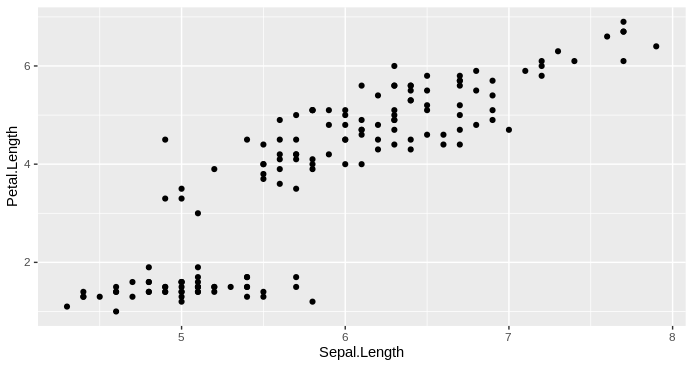
All ggplot2 plots begin with a call to
ggplot(), supplying default data and aesthethic mappings, specified byaes(). You then add layers, scales, coords and facets with+.
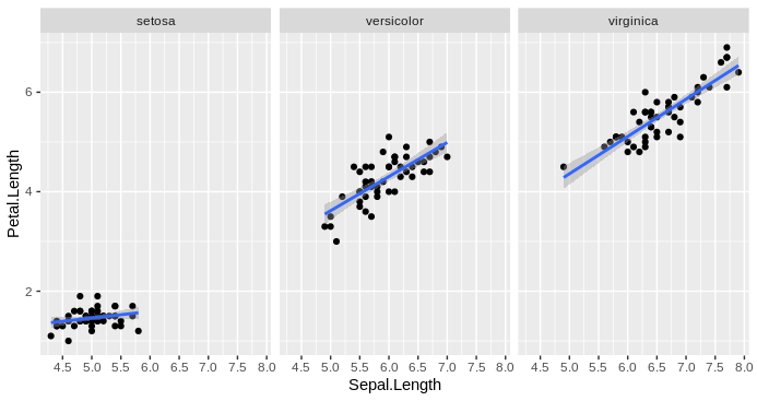
Example using the built-in dataset iris:
str(iris) # data structure of "iris" dataset
## 'data.frame':    150 obs. of  5 variables:
##  $ Sepal.Length: num  5.1 4.9 4.7 4.6 5 5.4 4.6 5 4.4 4.9 ...
##  $ Sepal.Width : num  3.5 3 3.2 3.1 3.6 3.9 3.4 3.4 2.9 3.1 ...
##  $ Petal.Length: num  1.4 1.4 1.3 1.5 1.4 1.7 1.4 1.5 1.4 1.5 ...
##  $ Petal.Width : num  0.2 0.2 0.2 0.2 0.2 0.4 0.3 0.2 0.2 0.1 ...
##  $ Species     : Factor w/ 3 levels "setosa","versicolor",..: 1 1 1 1 1 1 1 1 1 1 ...
library("ggplot2")
# initiate a plot for "iris" dataset,
# display "Sepal.Length" on the abscissa and "Petal.Length" on the ordinate
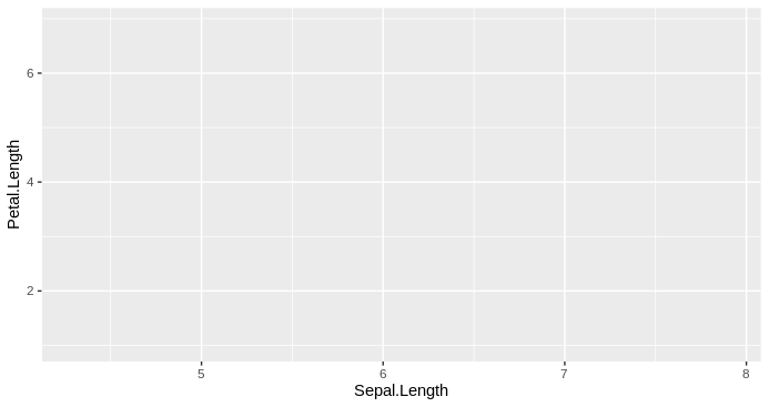
p0 <- ggplot(
data = iris,
mapping = aes(x = Sepal.Length, y = Petal.Length)
)
p0
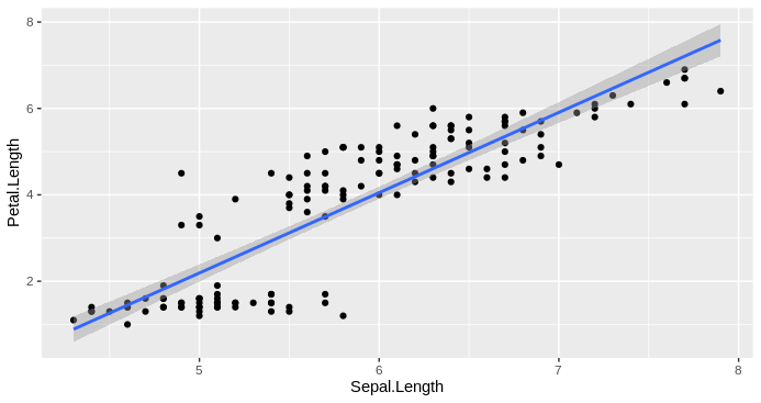
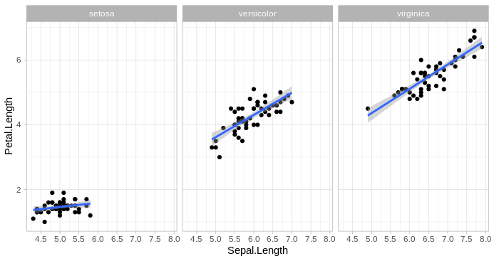
# add a linear regression model line calculated based on x and y
p2 <- p1 + stat_smooth(method = "lm")
p2
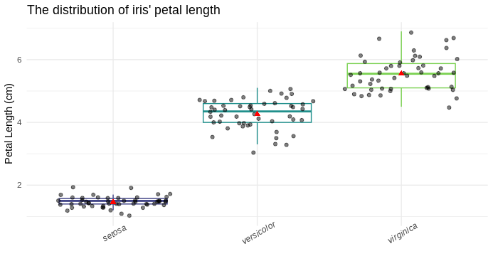
A Plot With More Detail?
p_box <- ggplot( # init plot
  data = iris,
  mapping = aes(x = Species, y = Petal.Length)
) +
  geom_boxplot( # add a layer of boxplot
    mapping = aes(color = Species), # colored by species
    outlier.shape = NA # hide outlier points
  ) +
  scale_color_viridis_d(begin = 0.2, end = 0.8) + # replace boxplot color by viridis palette
  geom_point( # add a layer of dots
    position = position_jitter(seed = 123), # use jitter position to avoid overlapping
    alpha = 0.5 # make the points transparent
  ) +
  stat_summary(# add summary of average value with specified form (a red point of shape 17 and size 2)
    fun = mean, shape = 17, geom = "point", size = 2, color = "red"
  ) +
  labs( # tweak labels
    x = NULL, # remove abscissa title
    y = "Petal Length (cm)", # change ordinate title
    title = "The distribution of iris' petal length" # add a title
  ) +
  theme_minimal() + # use the minimal theme
  theme( # extra tweaks on theme
    legend.position = "none", # hide legend
    axis.text.x = element_text(face = "italic", angle = 30) # show abscissa text at 30° angle with italic font face
  )
p_box
Please check the official reference manual of ggplot2 for the documentation of all functions. For more examples, please check:
- chapter 5 of a R course notes from the Aix-Marseille Université
- chapters 2 and 3 of Brendan's book
Volcano Plot & Heatmap
The volcano plot and the heatmap are two widely used figure types to show biological research results.
Check the chapter 19.11 Volcano plots of Sarah's book for a concrete example of how to build a Volcano plot for differential expression analysis results.
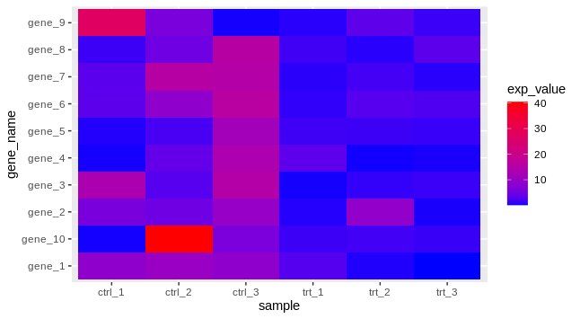
Heatmap need a bit more data manipulation before draw it with ggplot2. For instance, we want to visualize a set of 10 genes of 6 samples (3 control and 3 treated):
## prepare a toy dataset
set.seed(123)
exp_mat_ctrl <- matrix(rexp(30, rate = 0.1), ncol = 3)
exp_mat_trt <- matrix(rexp(30, rate = 0.8), ncol = 3)
exp_mat <- cbind(exp_mat_ctrl, exp_mat_trt)
colnames(exp_mat) <- c(
  paste0("ctrl_", 1:ncol(exp_mat_ctrl)),
  paste0("trt_", 1:ncol(exp_mat_trt))
)
rownames(exp_mat) <- paste0("gene_", 1:nrow(exp_mat))
exp_mat
##             ctrl_1    ctrl_2     ctrl_3     trt_1     trt_2     trt_3
## gene_1   8.4345726 10.048301  8.4314973 2.7097997 0.5254560 0.1132392
## gene_2   5.7661027  4.802147  9.6587121 0.6332697 9.0137595 0.3827548
## gene_3  13.2905487  2.810136 14.8527579 0.3244473 1.0571525 1.3340163
## gene_4   0.3157736  3.771178 13.4804449 3.2461151 0.2819275 0.3918953
## gene_5   0.5621098  1.882840 11.6852898 1.5362822 1.3754235 1.2183002
## gene_6   3.1650122  8.497861 16.0585234 0.9883522 2.8103821 2.3597791
## gene_7   3.1422729 15.632035 14.9674287 0.7866001 1.7046679 0.7057358
## gene_8   1.4526680  4.787604 15.7065255 1.5683013 0.7204896 3.2212017
## gene_9  27.2623646  5.909348  0.3176774 0.7358558 3.4065948 1.3096197
## gene_10  0.2915345 40.410117  5.9784969 1.4116125 1.6402038 1.2805517

## transform the data into "long" format (tidydata)
exp_df <- as.data.frame(exp_mat)
exp_df$gene_name <- rownames(exp_df)
exp_df
##             ctrl_1    ctrl_2     ctrl_3     trt_1     trt_2     trt_3 gene_name
## gene_1   8.4345726 10.048301  8.4314973 2.7097997 0.5254560 0.1132392    gene_1
## gene_2   5.7661027  4.802147  9.6587121 0.6332697 9.0137595 0.3827548    gene_2
## gene_3  13.2905487  2.810136 14.8527579 0.3244473 1.0571525 1.3340163    gene_3
## gene_4   0.3157736  3.771178 13.4804449 3.2461151 0.2819275 0.3918953    gene_4
## gene_5   0.5621098  1.882840 11.6852898 1.5362822 1.3754235 1.2183002    gene_5
## gene_6   3.1650122  8.497861 16.0585234 0.9883522 2.8103821 2.3597791    gene_6
## gene_7   3.1422729 15.632035 14.9674287 0.7866001 1.7046679 0.7057358    gene_7
## gene_8   1.4526680  4.787604 15.7065255 1.5683013 0.7204896 3.2212017    gene_8
## gene_9  27.2623646  5.909348  0.3176774 0.7358558 3.4065948 1.3096197    gene_9
## gene_10  0.2915345 40.410117  5.9784969 1.4116125 1.6402038 1.2805517   gene_10

# install.packages("tidyr") # we need the 'gather' function from this package
exp_df_long <- tidyr::gather(
  exp_df,
  key = "sample", # new column name to store the sample ID
  value = "exp_value", # new column name to store the value of each sample
  -gene_name # the column to skip when gathering
)
head(exp_df_long)
##   gene_name sample  exp_value
## 1    gene_1 ctrl_1  8.4345726
## 2    gene_2 ctrl_1  5.7661027
## 3    gene_3 ctrl_1 13.2905487
## 4    gene_4 ctrl_1  0.3157736
## 5    gene_5 ctrl_1  0.5621098
## 6    gene_6 ctrl_1  3.1650122

## visualize the data
p_heatmap <- ggplot(exp_df_long, aes(x = sample, y = gene_name)) +
  geom_tile(aes(fill = exp_value)) +
  scale_fill_gradient(high = "red", low = "blue")
p_heatmap
There is a built-in function in R stats::heatmap() to draw the graph directly.
But you can have more control on the figure (style, color, position, etc.) if you use ggplot2.
Other Chart Types
Please check the R graph gallery for more (complex, even dynamic) examples of different chart types.
Export Graphs
ggplot2 has an implemented function ggsave() to export the plots in a various formats (.png, .jpeg, .pdf, .svg, etc.),
by default it will save the last plotted graph if you don't specify.
ggsave(
  plot = p5,
  filename = "path/to/my_plot.png",
  height = 6.3, width = 4.7, units = "in", dpi = 200
)
Which Type of Plot?
- One variable: boxplot, histgram, pie chart, density plot
- Two quantitative variables: scatter plot (dots plot)
- Two qualitative variables: (nested) boxplot
- One quantitative and one qualitative: boxplot, violin plot
The eBook of Claus is interesting to have look for the general ideas of plot type to use and how to do a better visualization (not limited to ggplot2 figures).
And you can find the ggplot2 cheat sheet here.